Typography is the process of organizing text to make it more readable, visually appealing, and communicative. It includes selecting fonts, spacing (kerning, tracking, leading), and aligning text to produce effective designs. Effective typography enhances readability, expresses emotion, and reinforces brand identity. Some of the main elements are font choice, letter spacing, line height, and text alignment. Applications such as Pixellab assist users in creating beautiful typography effects for logos, posters, and digital designs, making content more engaging and effective.
In this post, we’ll share typography tips with Pixellab, whether you’re using it on a PC or Android. Let’s get into it.
1. Getting the Basics of Typography

Typography is one of those things that can make or break a design. It’s not just about choosing a cool font—it’s about making sure your text looks good and is easy to read. Let’s break it down into simple, easy-to-understand pieces.
Fonts and Typefaces:
A typeface is a group of fonts (e.g., Times New Roman), and a font is a specific style within that typeface (e.g., bold or italic). Selecting the appropriate typeface sets the mood for your design.
- Serif Fonts (e.g., Times New Roman, Garamond):
They have small “feet” at letter endings. They give a traditional and formal feel, ideal for printed material or serious work
latest typography tips for pixellab
- Sans-serif Fonts(e.g., Arial, Helvetica):No “feet” here—just modern and clean. They’re perfect for websites and computer designs.
- Script Fonts(e.g., Pacifico, Brush Script): These resemble handwriting. They’re formal or informal, frequently used on invitations or logos.
- Display Fonts(e.g., Impact, Lobster):These are dramatic and attention-grabbing, ideal for headings or logos but too flashy for long texts.
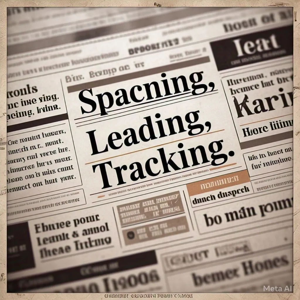
Spacing: Kerning, Leading, and Tracking
Spacing is absolutely critical in making text readable and visually appealing.
- Kerning: It is the area between two characters. Altering it will give words a smoother look, particularly in logos or large headings.
- Leading: This is the space between lines. Too tight and it feels stifling; too loose and it looks disassociated. Right amount makes it easy to read.
- Tracking: This refers to the area between each of the letters in a word or sentence. Increased tracking feels airy and open; decreased tracking feels bold and tight
Text Hierarchy:
Hierarchy is all about ensuring the reader understands what matters. You do this by having fun with size, weight, and color.
- Headings: Large and bold to draw attention
- Subheadings: Smaller than headings but still prominent, used to organize the text.
- Body Text: Simple and readable—this is where the main information resides.
Why It Matters:
When you nail these fundamentals, your design both looks great and gets your point across. It’s all about ensuring that readers can read and follow what you’re saying and not get confused or bored.
That’s all! Typography can be a wee thing, but it makes all the difference when it comes to how your work is received. Practice, and you’ll master it
Pixellab’s Built-in Fonts:
Pixellab comes with a bunch of pre-installed fonts, so you’ve got plenty of options to choose from:
- Serif Fonts: Perfect for professional or classic designs (e.g., Times New Roman).
- Sans-serif Fonts: Great for modern, clean, and digital projects (e.g., Arial, Helvetica)
- Script & Handwritten Fonts: Best for fancy or creative designs (e.g., Brush Script).
- Display & Decorative Fonts: Ideal for bold headlines or posters (e.g., Impact)
Quick Tip: Don’t use display fonts for more than one paragraph of text—they’re too hard to read. Save them for titles, logos, or branding.
2. Choosing the Best Font in Pixellab
Sometimes, however, you’ll want a unique font that’s not included in the Pixellab library
Don’t worry! To add your own, follow these steps:
- Get a Font: Download a TTF or OTF font file from Google Fonts, Dafont, or Font Squirrel.
- Extract the File: : If it’s in a ZIP folder, extract it first.
- Open Pixellab: Navigate to the Text Tool and tap on the font options.
- Import the Font: Choose ‘My Fonts’ and tap ‘Import Font’ to upload your file.
- Use It: Your custom font is now available to use in your designs.
Quick Tip: Organize your favorite fonts in a folder to save time on future projects
How to Choose the Correct Font?
It can be challenging to choose the ideal font, but these hints will assist:
1. Harmonize the Font with Your Design’s Mood
- Minimalist & Modern: Utilize clean sans-serif fonts such as Montserrat or Poppins.
- Luxury & Elegance: Utilize serif or script fonts such as Playfair Display or Great Vibes.
- Bold & Fun: Experiment with bold, bold fonts such as Bebas Neue or Oswald.
2. Choose Fonts Carefully
Limit to two fonts maximum—one for headlines and one for body copy. Here are some fantastic combinations:
- Sans-serif: Playfair Display (serif) + Lato (sans-serif).
- Bold + Light: Bebas Neue (bold) + Open Sans (light).
- Handwritten + Simple: Pacifico (script) + Roboto (sans-serif).
3. Make It Readable Size:
- Size: Headlines should be large and bold; body text should be legible.
- Spacing: Vary letter spacing (kerning) and line height for a tidy appearance.
- Contrast: Employ light text with a dark background (or vice versa) for readability.
Final Tips:
Try out different fonts and see what is best suited for your design.
Keep things simple—more than one font can make your design untidy.
Always ensure readability so your message comes through clearly.
How to Edit Typography Using an Android Phone | PixelLab by Photo Creativity
3. Adding Custom Fonts in Pixellab
In case you require a font that is not available in Pixellab, you can import one quite easily:
- Download a font (TTF or OTF) from Website like Google Fonts or Dafont.
- Extract the file if it’s within a ZIP folder.
- Open Pixellab, go to the text tool, and tap on font options.
- Import the font under ‘My Fonts’ and begin using it in your designs.
Choosing the Right Font for Your Design:
- Minimalist & Modern → Try Montserrat or Poppins.
- Elegant & Luxurious → Use Playfair Display or Great Vibes.
- Bold & Fun → Go with Bebas Neue or Oswald.
Keep two fonts max—one for headings, one for body text—for a clean, professional look.
4. Adding Effects to Text in Pixellab:
Pixellab has some serious effects that can help make your text stand out. Here are some ideas for making your text more interesting.
- Shadows & Outlines – Add depth and enhance readability on cluttered backgrounds.
- Gradient Text – Design fashionable, contemporary color gradients for a dynamic feel.
- Texture Overlays – Embed text with images or patterns for an interesting effect.
- 3D Text Effects – Create depth and perspective for a dramatic, cinematic look.
Try various effects to achieve the ideal balance between creativity and readability.
5. Perfecting Text Spacing & Layout:
Great fonts can appear unpolished without adequate spacing. Here’s how to optimize your typography:
- Kerning – Space letters so they are balanced.
- Line Height – Don’t pack text too tight, nor too much space.
- Text Alignment – Align left, center, or right to ensure structure and professionalism.
Tip: Spacing makes your design appear more polished and readable.
6. Advanced Typography Techniques in Pixellab
Want to push your typography even more? Experiment with these innovative techniques:
- Curved Text Paths – Design wavy or rounded text for a striking look.
- Text Masking – Fill text with an image for a chic effect.
- Layering Text with Images – Merge text into backgrounds for a smooth appearance.
- Using Shapes & Borders – Emphasize key text with boxes or frames.
These methods bring personality to your designs and make them memorable
7. Best Practices for Pro-Level Typography:
To obtain high-quality design in Pixellab, adhere to these typography best practices:
- Maintain a Clear Hierarchy – Direct the eye of the reader with thoughtful font sizes and fonts.
- Use Color Psychology – Colors affect perception (e.g., red for attention, blue for relaxation).
- Ensure Consistent Alignment – Use a single alignment approach for a professional appearance.
- Balance Decorative & Simple Fonts – Too many embellished fonts will damage readability.
Rule of Thumb: Make your typography simple, balanced, and pleasing to the eye
Conclusion:
Typography is not merely words—it’s a form of art that facilitates communication. With Pixellab’s tools and these pro tips, you can easily design professional, attention-grabbing designs.
